


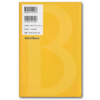
On the reverse of this book, what we’d consider as the obverse, is more yellow. There’s a bar code and price, too. ¥1600. One other thing our edition has is some sort of promotional strip that wraps around the lower third of the book. It’s a beige-colored strip that probably promotes or compares this book to Harry Potter for all we know. We’ve uploaded the full wrap-around strip to the forum – have a look and feel free to translate for us. Apparently each book in the Witch Association series has a different strip. A true collector's piece, we're sure....

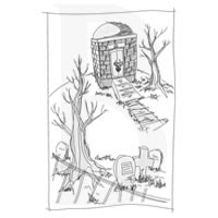
An unsettling mausoleum in the center of a cemetery serves as the frontispiece illustration and, surprisingly, there are more images throughout the book though mostly reversed for chapter headings. Edward Gorey’s three spot pieces from the original Dial edition (the omega, the concentric circles, and the shadow of the clock key) appear to be reproduced in miniature where appropriate. All of the illustrations are fluid pen-and-ink drawings unlike Edward Gorey’s work. They sit in the lower half of the page and their existence seems to beg poets to create haiku about them.
Like this:

opens wide it stomach
busy suitcase fills itself
for travels unknown
Or almost like that. Sorry.
The text itself is vertically and again we cannot decipher the characters. Indeed, the characters look impressive in their own way, but we don’t know what’s being said. Well, we do...we know the story...but – oh, you know what we’re talking about. On that note we’re not even sure how to translate the Fuse Box Dwarf into Japanese. (We wonder who’d make a better basement dweller anyway: the Dwarf or Totoro. Discuss.)
Artist House published the first eight books in the Lewis Barnavelt series in a span of just a few years, between 2001 and 2004. For us their uniform style and use of slick, eye-catching color evokes the Bantam paperback editions from the 1980s. We're told this artwork is by Hitsuji Kitasuna (北砂ヒツジ) and our own searches for more on this person have not yielded anything - maybe we'll know more in time.
It’s strange to consider that it’s only the foreign markets that have published nearly all the books in the Barnavelt series with cover art created by the same person. Publishing houses in Japan and Germany released eight titles of the eventual twelve with covers by the same person and France scored an additional two more for a total of ten.
No comments:
Post a Comment